modernisim for the kids

The aesthetic of modernisim is i think my favourite time for design, And all forms of design too, typography, architecture, product design, furniture design, film, photography even fashion. if i could take our more progressive mindset back to then i would time travel there in an instant. to discuss it here would be like blindfolding myself and playing pin the tail on the donkey to choose a topic, but it wouldnt matter where the pin landed.
Growing up i lived in a very plain suburban brick home, but my aunty lived in a mid century modern home, with exposed beams, giant japanese paper sphere lights, a modular velvet lounge you could lose yourself in. I was so jealous that we didnt live in a fabulous house like that. to this day i still fantasise about building my very own version of the farnsworth house in the australian bush.
it just seemed like there was purposeful and careful consideration in the design of every little thing back then. beauty existed alongside form and function. perhaps thats just me, as i love the style. clean lines, expansive clean surfaces and a reduced pallet of materials and colour. low and flat profiles for furniture and architecture. It was modern back then and to this day, it still presents as modern. mid century modern sits better than todays version of it, in my humble opinion. palm springs in the 50’s must have a been an absolute playground for adults, I would have loved to experience it myself.
adults weren’t the only ones to enjoy the clean adornment free style of modernisim. there’s my clumsy segway into where my modernist pin landed. it landed in the world of childrens books. One day I was on a referencing hunt, looking for inspiration for a School Holiday Arts Program i was designing. I came across an image from a childrens book… IT’S colour and simplicity just grabbed me, it looked so contemporary, it was henri’s walk to paris. designed by someone called saul bass??? Yeah I know, how did i not put all that together. to be honest i didnt know who he was at that time. boy was i in for a surprise. i ordered a copy of the book immediately…

Image of the cover for Henri’s Walk to Paris, designed by Saul Bass, written by Leonore Klein


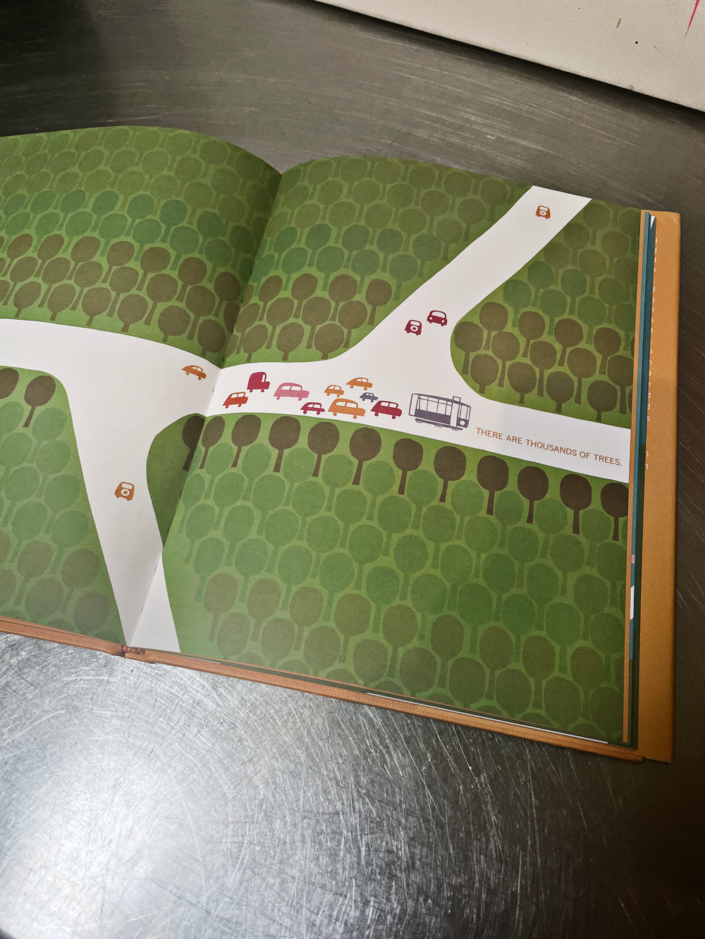


Images by stuart garske - my copy of Henri’s Walk to Paris
admittedly the book was first printed in 1963 but saul’s modernist design style is very present. Learning about Saul bass, the man was a trailblazer for modernisim in graphic design. Saul was lucky enough to attend classes under the tutelage of György Kepes, who had started the Institute of Design (or New Bauhaus) in chicago. both hugely influential designers whose work still influences and informs contemporary design.
Some design just grabs you, even without you having the backstory to who created it. Saul bass has created some of the worlds most recognisable logos, but he is probably more widely known for his film title sequences and movie posters. He invented kinetic typography, one of my favourite examples of this is the title sequence for North by northwest by Alfred Hitchcock.

Film Sequence from Alfred Hitchcocks North by Northwest - Kinetic Typography animations by Saul Bass
saul’s work can be easily recognised by his use of bold flat colour and shape. His designs hold an honest simplicity and express the human hand behind the considered designs. it is his use of colour that made that wonderful childrens book so successful on so many levels to adults and children alike.
My inner child is very close to the surface, it could be one of reasons why I love this design style so much. It’s simplicity and vibrant energetic use of primary colours excites the child within.
working at the same time as Saul, There was another man, an illustrator, animator and designer, this man also loved bold blocks of primary colour and simplified stylistic design. His name was Theodor Seuss Geisel, commonly known as Dr Seuss.
A prolific author of childrens books, dr seuss wrote only one feature film, The 5,000 Fingers of Dr. T. a surreal dreamlike fantasy musical that when released in 1953 was Widely panned by critics. but it is loved for it’s production design, memorable costume design and set design. It is an artists exploration in abstract modernisim. The colour pallet of the film is primary, like a mondrian painting come to life. Whites, reds, blues and yellows make up this world, while the villain lives in purples and mauves. The film is a feast for the eyes through it’s simplicity of form, perspective and colour.
two very different designers that inhabit a very similar space, in terms of the design movement they were both born into and helped develop. Both leaving us a lasting legacy of modernist design.


“hey swiss, let’s get off grid, here comes postmodernism”